Welcome to a blast from the past! Before Flexbox and Grid swept in like the superheroes of modern web design, there was a time when floats and clears ruled the CSS universe. If you’re a web design newbie, you might be wondering, “What on earth are floats and clears, and why should I care?” Well, buckle up, because we’re about to take a nostalgic trip through CSS history.
Spoiler: you might find some cool tricks to use today!
Floats: The Original Layout Trickster
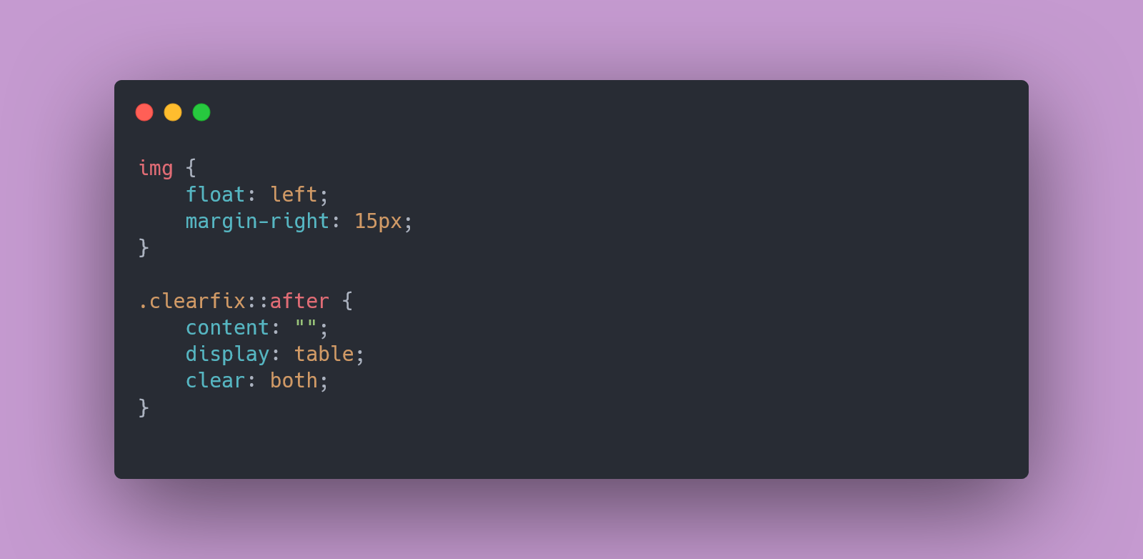
Imagine float as the rebellious teenager of the CSS world – always breaking out of the line and causing a bit of chaos. Floats were originally designed to wrap text around images, but clever developers quickly realized they could use them to create layouts too.
img {
    float: left;
    margin-right: 15px;
}
In the example above, float: left; makes the image “float” to the left, allowing text to wrap around it. Floats were a popular choice for creating multi-column layouts before Flexbox and Grid came along. However, they can be a bit finicky and prone to causing layout issues if not used carefully.
Clears: The Peacekeepers
Floats might have been a bit rebellious, but clears were their peacekeepers. The clear property is like the mediator that steps in to resolve the chaos floats might create. If you’re using floats and find that elements are overlapping or not behaving as expected, clear can help.
.clearfix::after {
    content: "";
    display: table;
    clear: both;
}
By adding a clearfix class with the above CSS, you ensure that any floated elements are contained within their parent container. It’s a nifty way to prevent those annoying layout glitches where elements seem to float off into the abyss.
The Legacy Layout Techniques: A Retro Revival
Before Flexbox and Grid stole the spotlight, CSS had a few more tricks up its sleeve. Here’s a look at some classic layout techniques:
- Inline-Block: A simple method for creating horizontal layouts. By setting elements to
display: inline-block;, you can line them up side by side without the need for floats.
.box {
    display: inline-block;
    width: 30%;
    margin-right: 2%;
}- Table Layouts: Yes, tables weren’t just for tabular data! You could use
display: table;,display: table-row;, anddisplay: table-cell;to create grid-like layouts.
.container {
    display: table;
    width: 100%;
}

.item {
    display: table-cell;
    width: 33%;
}
These methods have been largely overshadowed by modern layout techniques but still offer a glimpse into the evolution of web design.
Modern-Day Application: Mixing Old and New
So, do floats and clears still have a place in the world of modern web design? Absolutely! While Flexbox and Grid are now the go-to tools for creating layouts, floats and clears can still be useful in certain scenarios, like simple layouts or when working with legacy code.
For instance, you might use floats for text wrapping or when you want to align a small number of elements in a straightforward way. But for complex, responsive layouts, Flexbox and Grid are your best friends.
Wrapping It Up
Floats, clears, and other legacy layout techniques might seem like relics from the past, but they’re part of the rich history of CSS. Understanding them gives you a solid foundation and helps you appreciate the power of modern layout systems. Plus, knowing these old-school tricks can come in handy when dealing with older projects or quirky design challenges (or those dreaded interview rounds).
Happy coding!
Leave a Reply