Welcome to the magical realm of CSS positioning, where you get to play architect and designer for your web elements! If you’ve ever wondered how to put that button exactly where you want it, or how to make sure your header doesn’t wander off, you’re in the right place. Let’s dive into the basics of CSS positioning with a touch of wit and a sprinkle of fun.
1. Static Positioning: The Default Setting
Static positioning is like the default setting on your TV. Nothing fancy, just basic and straightforward. By default, all elements are statically positioned; which means they flow in the document as you’d expect – one after another.
div {
    position: static;
}
When you use position: static;, you’re essentially telling the browser to lay out the element in its normal spot, just like it would naturally. It’s the “nothing to see here” of positioning.
2. Relative Positioning: The Slightly Shifty Friend
Relative positioning is like having a friend who’s always slightly out of place but in a charming way. It lets you move an element relative to where it would normally be, without disturbing the rest of the page.
.relative-box {
    position: relative;
    top: 10px;
    left: 20px;
}
Here, .relative-box will be shifted 10 pixels down and 20 pixels to the right from its original position. The rest of the elements around it will still be in their original spots.
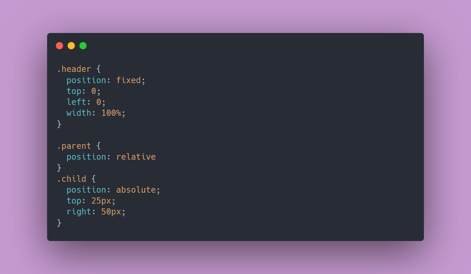
3. Absolute Positioning: The Freedom Seeker
Absolute positioning is like your adventurous friend who doesn’t follow the crowd. It lets you position an element anywhere you want, relative to the nearest “non-static” ancestor (i.e., an ancestor with position: relative, absolute, fixed, or sticky).
<div class="parent">
    <div class="child"></div>
</div>
.parent {
position: relative;
}
.child {
position: absolute;
top: 30px;
right: 10px;
}In this example, .child will be positioned 30 pixels from the top and 10 pixels from the right of the .parent. If .parent wasn’t there, it would be positioned relative to the nearest positioned ancestor or the viewport.
Pro Tip💡
When an element is absolutely positioned inside a parent withtransformapplied, it's positioned relative to the transformed parent, not the original document flow. Be mindful of this behavior to avoid unexpected layout shifts and positioning issues.
4. Fixed Positioning: The Stubborn Static
Fixed positioning is like having a favorite chair that you never move. It lets you position an element relative to the viewport, so it stays in the same spot no matter how much you scroll.
.floating-action-button {
    position: fixed;
    bottom: 20px;
    right: 20px;
}
With position: fixed;, the .floating-action-button will stay 20 pixels from the bottom and 20 pixels from the right of the viewport, even if you scroll down. It’s perfect for those sticky elements like the header of your site or a chat widget or a persistent call-to-action button.
5. Sticky Positioning: The Best of Both Worlds
Sticky positioning is like having a friend who’s always partially in and out of the spotlight. You can think of it as a hybrid between relative and fixed positioning. An element with position: sticky will stick to its position within its container when you scroll past a certain point, but otherwise behaves like a relatively positioned element.
.sticky-box {
    position: sticky;
    top: 0;
}
In this example, .sticky-box will stick to the top of its container once you scroll past it and remain there as you continue scrolling, but only as long as the container is in view. When the container scrolls out of view, the sticky element will scroll with it. It is great for headers, navigation menus, or sidebars that you want to stay visible within a certain section of your page.
Z-Index: The Overachiever
Ah, the z-index! This is where things get a bit competitive. When elements overlap, z-index determines which one sits on top. It’s like a high school popularity contest, but for your web elements.
.box1 {
    position: absolute;
    z-index: 10;
}

.box2 {
    position: absolute;
    z-index: 5;
}
In this case, .box1 will appear above .box2 because it has a higher z-index. Just remember, z-index only works on positioned elements (relative, absolute, fixed, or sticky).
Pro Tip💡
There's more toz-indexthan what was explained above. Stay tuned for a deeper dive into "stacking contexts", which will give you a fuller understanding of howz-indexworks in complex layouts.
Wrapping It Up
CSS positioning might seem like a puzzle, but once you get the hang of it, you’ll be placing elements with precision and flair. Each position type has its own special role in web design. Try them out and see how you can make your web page look just right.
Happy coding!
Leave a Reply